 Wednesday, 15th Jun 2011 07:37 by Ash Rose Ash concludes his look at the best and worst Premiership kits from our last stay in the top flight with a rundown of the ten best. The early nineties were a memorable time for football kits - small shorts, big collars and outrageous colour schemes were all very much sign of the times as English football welcomed in the Premier League era. Mega-money kit deals were very much in their infancy and were designed with more thought on originality and how different they’d look on the field, then concerns of how people down the pub may look in it. Nowadays, kits have become too simple, too templated and rarely surprising. So, here is my look back at the ten best kits of Rangers Premier League era... Top Ten Best… Kits
Though I was a big fan of the 1992 kit that is tinged with memories of our successful maiden Premier League campaign, it was in theory the same kit as the previous season bar the sponsor and so the number one spot goes to this, the 1994 home effort. For me this is everything a QPR shirt should be, and while my all time favourite jersey is the 1990 shirt (mainly down to Roy Wegerle) from a pure shirt point of view this is a winner. The collar was simple and comfortable, the hoops were nicely spaced and liked how many they were, while I also like the hoops stretching to the sleeves too. And the sponsor was simple and added a touch of red to the shirt. The final touch for this shirt was the QPR badges sewn into the fabric of the shirt, that shone during the early season sun. A very worthy winner. You may remember this from… Les Ferdinand’s master blaster against Man Utd, and his last goal at Loftus Road against Spurs. As much as the Dennis the Menace hoops are sewn into the fabric of our history, we often have to relent from having that change jersey and in 1995 we came-out with this navy number, made by now defunct sportswear brand View From. The navy was broken-up by thin white hoops across the shirt with the sponsor Compaq and the badge moved to the centre. The comfortable shirt was topped off with a simple round collar and View From’s wavy TV lines like logo on the sleeves. Hands down still my favourite ever QPR away kit, and a shirt I still wear around the house and playing five-a-side (the number of double-takes I get grows every season). It’s a template later used on a 1999 Man Utd away kit. You may remember this from… Rare away successes that year, a 3-1 win at Elland Road closely followed by a 1-0 win at Bolton where we paired it with our white home shorts. I remember sitting in my school canteen, before the days of spending hours on the net surfing kit websites and forums and looking up to see an Arsenal shirt unlike any other I’d seen previously. It may have been that very point my kit obsession started and it’s easy to remember why. Gone was the traditional yellow that Arsenal played in away from home and was replaced by a sleek looking combination of navy and lightening blue. But this was no normal combination, the lighter blue was actually designed to look like lightning down the right-half of the shirt giving it a unique and yet repeated design for the Gunners. You may remember this from… Dennis Bergkamp’s maiden Premiership season, although he was in their first choice red shirt when he scored at Loftus Road that year. You may notice a blue theme going on throughout the top few of these, as I naturally have an affinity for that shade of kit but this was another beauty from the early 90’s United Umbro catalogue. The all royal blue jersey had a design unlike any kit I’ve seen before and since, which a huge black out-lined Man Utd crest dominating the bulk of the shirt and black swirls almost like swimming pool ripple surrounding it. It came in the same season as the green and yellow halved Man Utd shirt which was another fine effort in a stellar collection from Umbro that year. Cast your minds back to the first ever Sky Super Sunday (fireworks, parachute jumpers and Richard Keys’ ghastly bright blazers) and you may recall a Nottingham Forest win over Liverpool wearing this smart polo-like shirt. The collar emphasized the polo shirt effect and was complemented by a red shirt with white pin-stripes going vertically down the jersey. Interesting that Forest have gone back a similar template for this season’s kit, as it’s something I wouldn’t mind seeing Rangers do this year too. You may remember this from… Gary Crosby’s late City Ground winner against Rangers – our record at that stadium continued despite us sitting fifth and Forest heading for relegation. Although first released in 1991, this shirt was held as Spurs’ third kit for three seasons - although you’ll be hard pressed to find many games when they actually did wear it. An unusual gray-blue colour made up the predominate shade of the shirt, which had a dark polo-like collar. The eye-catching dimension to this shirt though was the word SPURS spelt out on the kit in giant letters on the chest of the jersey, that faded in and out at either ends like it was halfway through a powerpoint motion slide. A typical early 90’s Umbro shirt that came from the same ilk as the post 1990 World Cup England range. Another shirt from White Hart Lane and was the last Umbro kit before they went under the ‘guidance’ of American sportswear brand Pony. This jersey is best remembered as the ‘Jurgan Klinnsmann’ shirt, which he wore on his Spurs debut an famously celebrated his goal by diving to the ground. The polo collar remained on this navy shirt with white trimmings but a third colour had been added to the Spurs pallet - purple. Appearing on a lot of the Tottenham training range that year and on this shirt in a brush strokes across the right of the shirt and on the left sleeve. Not two colours you’d think of to put together but worked very well on this kit. You may remember this from… A 2-1 QPR win in blazing heat at Loftus Road when Les scored twice, his final two QPR goals on that ground. When Liverpool launched a new badge for the Premier League era, they introduced a shade of green into the pallet that was first used in the early part of the decade which some striking green away shirts. However, my favourite of that era came a few season’s later and is not so well remembered as the 1996 FA Cup Final losing shirt. Quarters are something rarely seen in football shirts outside of Wycombe so this remains a unique design from Adidas, using the Liverpool green and white to create this shirt. A third entry for Rangers as they joined the early nineties bandwagon of black away shirts with an impressive outfit from ‘Rangers Clubhouse’. I seem to recall that when QPR kicked off that season with CSF as their new sponsor, the companies full title, Computer Solutions and Finance was scrawled across the front of the kit but someone most of twigged early on that it was far too much and it was quickly reduced to just letters. The big collar from the previous shirts seasons shirts remained and the little black number was complemented with a trimming of red on the collar and cuffs. You may remember this from… A 4-1 opening day defeat at Aston Villa that turned into a mini goal of the month competition between Les Ferdinand, Dean Saunders and Steve Staunton. If early Premier League kits are remembered for anything, it should be the trend of laced collars that has seems to have remained very much part of that era. Man Utd, Ipswich and Oldham are dabbled with laces but it was this Aston Villa creation that was my favourite of the lot. Although it had laces, it refrained from a polo type collar and went for a more simple round neck that was then emphasized with a sky blue band round the top of the shirt for the laces to hang-down on. The bands were repeated on the arms in a kit that Villa almost won the league in and for which Dalian Atkinson won goal of the season. You may remember this from… One of QPR’s numerous Sky defeats that season, sealed late on by Dalian Atkinson after Darren Peacock had inexplicably fallen on his arse. We’re on Twitter you know, @loftforwords, come and get in our car and we’ll give you a sweetie Photo: Action Images Please report offensive, libellous or inappropriate posts by using the links provided.
You need to login in order to post your comments |
Blogs 31 bloggersSwansea City Polls[ Vote here ] |

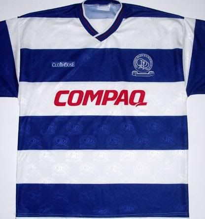 1 QPR Compaq 1994-95
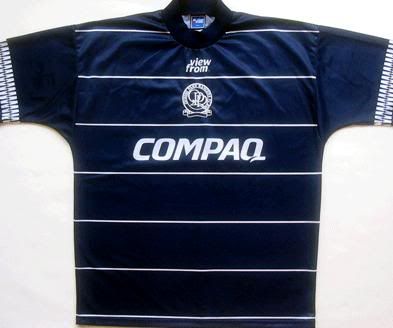 2 QPR Away 1995-96
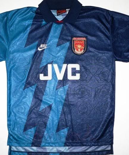 3 Arsenal Away 1995-96
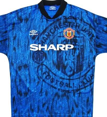 4 Man Utd 3rd 1992-93
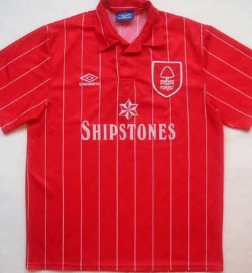 5 Nottingham Forest home 1992
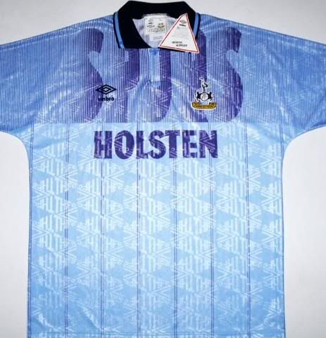 6 Tottenham 3rd 1992-93
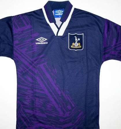 7 Tottenham away 1994-95
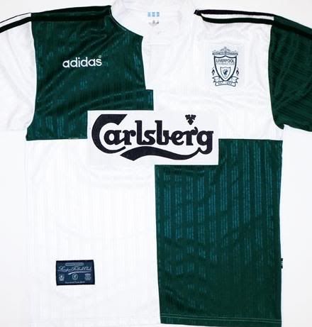 8 Liverpool away 1995-96
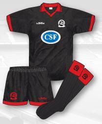 9 QPR third 1993-94
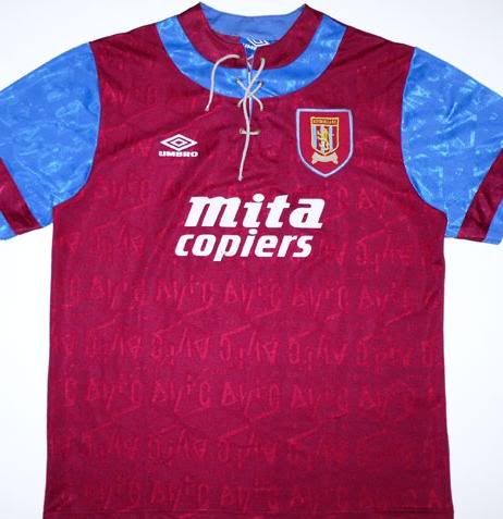 10 Aston Villa Home 1992-93