| Crest Vote on 12:54 - Dec 15 with 2614 views | aston_hoop |
Gone for option 2. And lets face it, its a lot bloody better than the current one |  |
|  |
| Crest Vote on 12:57 - Dec 15 with 2608 views | BrianMcCarthy |
No.1 - excellent. Stylish and clean.
No. 2 - better again. Beautiful
No. 3 - too much going on
No. 4 - fugg off with that crown. Hate royalty, we're not royal. Why not draw a park instead? Or a picture of the Ranger from Yogi Bear?
Overall, I think they've done very good work. I voted for 2, and found myself singing a Rangers song while I put a cuppa on for myself. |  |
| |
| Crest Vote on 13:09 - Dec 15 with 2563 views | Toast_R |
Obviously it's 2.
3 & 4 look like a throw back from the opening title to an cheesey tv show from the 70s. |  | | |
| Crest Vote on 13:38 - Dec 15 with 2498 views | Metallica_Hoop |
2 |  |
| Beer and Beef has made us what we are - The Prince Regent |
| |
| Crest Vote on 13:41 - Dec 15 with 2489 views | CroydonCaptJack |
The first two look ok. Number two is beat imo. |  | | |
| Crest Vote on 13:52 - Dec 15 with 2445 views | izlingtonhoop |
None of the above. |  | | |
| Crest Vote on 13:55 - Dec 15 with 2433 views | Northernr |
| Crest Vote on 12:39 - Dec 15 by Dorse |
Paying a design consultancy? Based on what we've been offered, I'd say we paid for crayons and a pair of scissors.
Dan Thingy (the guy that did DaveB's avatar, him) did better and I'd have had no problems with any of his designs. The club missed a trick there.
Apologies to Dan and all the members of the Thingy family for forgetting their names. |
Dan Norris is who you're on about and the club didn't miss a trick because he was involved in the process and badges three and four are his designs. |  | | |
Login to get fewer ads
| Crest Vote on 13:58 - Dec 15 with 2419 views | DannyPaddox |
Stop Press: Late Entrant: Vote now!
 |  | | |
| Crest Vote on 14:00 - Dec 15 with 2404 views | Mvpeter |
These are all very similar. I don't see why we couldn't have had the current badge and the last one in there too. |  |
| |
| Crest Vote on 14:00 - Dec 15 with 2405 views | Northernr |
I wouldn't be unhappy with 3. They're all an improvement. | | | |
| Crest Vote on 14:02 - Dec 15 with 2387 views | DeepcutHoop |
All terrible. Awful in fact.
Can we keep the current one instead? | | | |
| Crest Vote on 14:09 - Dec 15 with 2354 views | CamberleyR |
Growing to like #3 the more I look at it on the shirt. |  |
| |
| Crest Vote on 14:11 - Dec 15 with 2344 views | daveB |
| Crest Vote on 13:55 - Dec 15 by Northernr |
Dan Norris is who you're on about and the club didn't miss a trick because he was involved in the process and badges three and four are his designs. |
wow, those are the weakest 2 imo, The ones he did on twitter were far better | 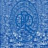 | | |
| Crest Vote on 14:12 - Dec 15 with 2340 views | rsonist |
Well I certainly wouldn't want to be in the club's shoes running this public consultation with you lot. Bitter sods.
2 will please everyone I think, because closest to the previous crest. I think it already looks a bit dated though, especially with that font.
I'm very taken with 3 myself. Clean, smart, pleasingly symmetrical, and nicely balances history with a modern look. Shame it won't win. |  | | |
| Crest Vote on 14:12 - Dec 15 with 2336 views | Gloucs_R |
| Crest Vote on 14:11 - Dec 15 by daveB |
wow, those are the weakest 2 imo, The ones he did on twitter were far better |
Without trying to sound like your lover...agree again with you. |  |
| |
| Crest Vote on 14:14 - Dec 15 with 2330 views | JonDoeman |
Number two is going to piss it if what I'm seeing on the interweb is a true reflection.
Shame, one is better. |  |
| |
| Crest Vote on 14:18 - Dec 15 with 2307 views | kingo |
A combination of 2 and 3 for me. I like the stand alone lettering on 2 and the plain 1882, but like the extra Hoops on 3 , but don't like the way the R becomes the hoops. Alternatively just take off Flavio's hair ( which isn't a proper Mantle) and the Imperial Crown and keep the existing one, |  |
| RIP: Sniffer, Doug and Pat |
| |
| Crest Vote on 14:32 - Dec 15 with 2256 views | Northernr |
Any suggestion that the current one isn't that bad, or would be fine with slight modifications, make me laugh/cry. You'd have thought the club had used chemical weapons to bomb an orphanage to create space for Patrick Agyemang to park his Bentley given the scale of reaction against it at the time. Now... hmmm might not be that bad after all.  | | | |
| Crest Vote on 14:35 - Dec 15 with 3387 views | 1MoreBrightonR |
i quite like 1 and 2. You'll never please our fans on this so it doesnt really matter what process the club goes through! | | | |
| Crest Vote on 14:41 - Dec 15 with 3371 views | robith |
As someone who works in advertising and marketing, I am bemused at the presumption that we make a lot of money! |  | | |
| Crest Vote on 14:43 - Dec 15 with 3369 views | BklynRanger |
Option 2 is the clear winner for me. Clean, straightforward, does a decent job of correcting the tacky atrocities that the current badge has been committing.
Option 1 would be runner up - same good clean lines but I don't know about retro stuff, it can date pretty quickly.
3 and 4 are non starters far as I'm concerned. The text is all squashed in there like an anus. Bit worrying like they include the great opportunity that closed hoop idea offers - they sound enthusiastic about that. |  | | |
| Crest Vote on 14:47 - Dec 15 with 3355 views | kingo |
| Crest Vote on 14:32 - Dec 15 by Northernr |
Any suggestion that the current one isn't that bad, or would be fine with slight modifications, make me laugh/cry. You'd have thought the club had used chemical weapons to bomb an orphanage to create space for Patrick Agyemang to park his Bentley given the scale of reaction against it at the time. Now... hmmm might not be that bad after all. |
Always liked the actual shield with the Hoops, Plus a new one will ruin the symmetry of my tattoo. which includes the new badge ( less the wig and crown). I remember people being upset when we got the new badge in the 70s. No one knew about the 82 badge until we started buying Cup Final stuff, caught the street vendors out. | |
| RIP: Sniffer, Doug and Pat |
| |
| Crest Vote on 14:52 - Dec 15 with 3340 views | Mytch_QPR |
I'm a bit of a luddite with these things - tried to go for #2, ended up voting for Reggie and Bollie.
#2 will probably win, as for most fans it harks back to the 90s when we were relatively proper - and it looks okay (IMO) - I can appreciate that some older fans will relate more to #1.
The current crest is over-complicated and naff ('boutique') - can't wait to see the back of it. |  |
| |
| Crest Vote on 15:04 - Dec 15 with 3298 views | simmo |
The more I look at them, the more I like them all.

The 4th one reminds me of Inters badge |  |
| ask Beavis I get nothing Butthead |
| |
| |