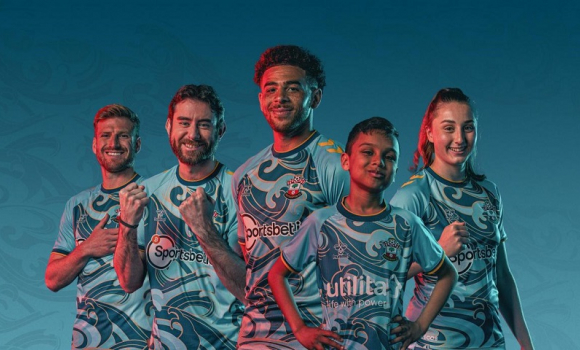
Saints Release 2022/23 Away Kit Monday, 4th Jul 2022 11:58 Hot on the heels of the appalling home kit for the 2022/23 season comes the 2nd kit and if you thought the colours were bad enough then the PR blurb is just as bad. It is obviously on the record that I did not like this seasons home kit and judging by social media I was not in the minority with Red being in short supply on the kit when we play at St Mary's and from behind you would think it was Fulham.
Now I may be a traditionalist on the home Saints kit, but I do accept that these days the 2nd kit is where you go mad on different colours etc, but our latest design which is impossible to describe, looks like something that would have been worn at a rave in 1989. But I can live with it, it won't look like anything seen on a football pitch elsewhere and may be a bit hard on the eyes, but I have seen worse mainly in the 1990's apparently our bold new teal, aqua and gold away shirt takes it's inspiration from the docks and our proximity to the Solent.
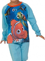
Show me where it is inspired by the Docks, is their a crane, a ship, a container, a seagull or a docker ? I can see why it might be inspired by the sea in a Spongebob Squarepants sort of way, all that is missing is Dora from Finding Nemo to truly make it a design any 5 year old would be proud to wear to bed at night.
2022/23 AWAY TRACKSUIT IS ALSO AVALABLE IN ADULT SIZES But once again the PR blurb is absolutely poorly researched and written expanding on the Bold Is Brave theme expounded in last weeks home kit launch. The person who has put their name to it is our head of Marketing & Partnerships Sarah Batters, here is what she has to say. “This season’s away shirt is our boldest yet and it’s a proud reminder of where we come from, taking inspiration from the Solent. Working with hummel on this shirt has really allowed us to push the boundaries of creativity and bravery. We know our fans may be divided on their opinions of the shirt, given the colour choice and standout pattern, but we look forward to seeing it worn by our fans.” I'm sorry Sarah but this is PR Bulls*t at it's finest, the type of statement that gets ridiculed in comedy sketches usually when a comedian is sending up the stereotypical media luvvy. There is little inspiration from the Solent, a strait which at a rough guess is about 10 miles up Southampton Water from the city itself, the Solent is not where we come from, perhaps if you had mentioned Southampton Water or the Test or the Itchen, it would have resonated with Southampton supporters. The design maybe pushes the boundaries of creativity and bravery, but I would say from a perspective of whoever designed it was possibly hoping to get a job at Disney and whoever commissioned and signed off this design is brave enough to put their job on the line, add this kit to the home kit launched last week and football fans across the country are going to be laughing at us. I hate to say this but our friends at the other end of the M27 must be laughing at us, they may have an owner who once worked for Disney, but they are not Mickey Mouse in their choice of kits, their home kit is always solidly blue, white shorts and red socks no mucking about with their history and tradition there.
Allan Vad Nielsen, CEO for hummel, added: “We are proud of our partnership with Southampton. This season’s away shirt has given us the chance to work together to really push the boundaries and create the boldest yet. It’s a bold direction to take, but we hope this has resulted in a shirt that will spark conversations amongst fans and inspire them to be brave in wearing it.” Yes the shirt may well be our boldest yet and pushed boundaries, but Allan completely misses the point here, we do not want our boundaries pushed and to be bold, we are football fans, we want to see our team play in a shirt that defines us as a football club, that is recognisable to other fans when they see us play whether at a stadium or TV and that can be worn around town, to the pub and to the match without being pointed at and laughed. It should be noted that 35 years ago hummel created perhaps the most despised kit in our history when we and Aston Villa wore their half and half stripes kit.
Southampton fans are not an experiment for our Director of Marketing and Partnerships and the CEO for hummel to boost their ego's and CV's, these things are to be worn on a football pitch not a fashion catwalk. Allan Vad Nielsen is right it will spark conversations amongst the fans, few of them will be complimentary about his company and whoever gave the go ahead within Southampton Football Club for these kits. Lastly yes the fans need to be brave but only in wearing it out in the street ! I don't like having to name and shame people, but Sarah Batters and Allan Vad Nielsen have come out with two of the most absurd statements I have ever seen issued in the name of Southampton Football Club. They might be very experienced is their fields, but sadly those fields are not football ! Photo: Action Images Please report offensive, libellous or inappropriate posts by using the links provided.
You need to login in order to post your comments |
Blogs 31 bloggersWolverhampton Wanderers Polls |


