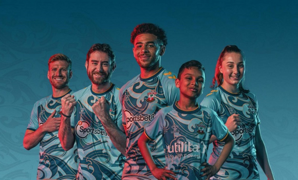
Southampton New Away Kit Complete Rip Off Of Newport County's Last Season Monday, 4th Jul 2022 12:55 The press announcement for Saints new away kit spoke of being bold and brave and inspired by the Solent, but it turns out it is nothing of the sort and a year ago was inspired by the River Usk which flows through Newport in Wales. Newport County have got their revenge for the 8-0 drubbing we gave them 11 months ago by donating their 2nd kit to us for this season. An hour ago I spoke about how appalling our new away kit was and how the PR blurp for it was shocking. But if I though I could be shocked further I was wrong, it turns out that this shirt is not bold and brave, nor the Solent and it isn't as unpredictable as the swirling south coast seas that inspired it, as our Director of Marketing & Partnerships Sarah Batters told us this morning to general disbelief and uproar to the majority of the Saints supporters.
It turns out that although not quite an exact copy, it is very much like the kit that Newport County wore in League Two last season. When Newport County revealed their kit designed and produced by hummel on July 30th 2021 they had this to say. "The shirt - inspired by the River Usk which flows through the city - features light and dark shades of teal, while the Exiles' traditional home colours are also present." "The panel graphic on the front of the shirt is developed directly from looking at the river and is representative of the ripples and eddies that appear as it flows."
Sound familiar ? Of course it does, although ours isn't inspired by the two rivers that flow through our city, but the Solent some 10 miles away whose waters wash on the shores of our most hated rivals Portsmouth. The big question is whether Southampton FC and indeed our Director of Marketing & Partnerships Sarah Batters knew this shirt existed or whether they were hoodwinked by hummel who designed both strips. As I mentioned this is not an exact replica, our "waves & ripples" are bolder and brighter than Newport's, but it is a near enough copy to suggest that hummel didn't have a lot of work to do on this design, they merely had to tweak the pattern a little. So did they tell us that this design had effectively been used before and if not why not, if they did then serious questions need to be asked about those that sanctioned this kit and indeed the press release that was very similar to that used by Newport a year ago. Quite frankly if this kit had not made us a laughing stock in the first place or even the second with the press release, it has managed it on the third attempt when we find out it is a blatant rip off and not very original at all. A quick look at the Newport County website shows that there version from last season is now on sale, I would suggest if you want the adult socks they are virtually identical to the Saints version, but at £4 are £8 cheaper. On a serious note how did whoever is responsible for this let it happen, surely any sensible person with an ounce of knowledge about the psyche of football fans would have vetoed it at the first sighting, or did hummel truly convince us this was a good idea. Photo: Action Images Please report offensive, libellous or inappropriate posts by using the links provided.
You need to login in order to post your comments |
Blogs 31 bloggersRotherham United Polls |


