Back To Stripes Back To Reality For Southampton
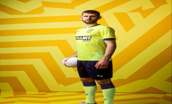
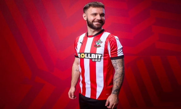
Tuesday, 16th Jul 2024 21:01 Southampton FC are returning to the Premier League and they are doing so with a return to their traditional Rec & White Stripes for the home kit and for the away kit it is another retro feel with yellow shirts and Navy shorts.
Usually this is the time of year I get on my soap box and rant about how our latest marketing and executives in charge of choosing the kit have been actually clueless in their choice of design as was the case just two years ago when our relegation to the Championship came with us wearing what was our worst ever home kit.
But this season I have little to complain about, for the first team kit it is back to red & white stripes and a traditional look to the shirt, the away shirt is also back to our traditional yellow with blue shorts.

This is the first time was have used Puma as a kit supplier as a club and although I have to say I have never been a great fan of their sportwear, I can't complain about what they have knocked up for us this time.

The home kit is distinctively Southampton FC, when you see red & white stripes you think of Southampton, Sunderland, Sheffield United & Stoke, red & white stripes are the identity of all four clubs and it is great to see Saints back to stripes.

Photo: Action Images
Please report offensive, libellous or inappropriate posts by using the links provided.
WoolstonSaint2 added 21:13 - Jul 16
Ruined by a gambling sponsor. Saints should be ashamed- a club proud of its community foundation thinks it is acceptable to advertise gambling so prominently. A sickening decision |  | |
Monksway added 21:37 - Jul 16
I'm 66 so my early memories of Saints are Ron Davies in red and white stripes and John McGrath in gold and black! But over the course of my lifetime Saints have often innovated with assorted versions of predominantly red/white shirts and black shorts. I baulked at "all red" but otherwise accept that these kits are simply a part of the contemporary commercial culture of modern football. |  | |
Saidou added 21:45 - Jul 16
It really is a shame we again choose Gambling connections. I stopped buying shirts since we ditched our traditions and decided to follow the rest. That means we will always be behind “following “ what others do instead of sticking to our traditions and ethics and looking for innovative ways to surpass the rest. We should stop being a lazy copycat. |  | |
ItchenNorth added 22:18 - Jul 16
I'm not a fan of red and white stripes, never have been never will. We just go back in the pack with the likes of Sunderland, Stoke, Sheffield Utd and Brentford.
Saints have had some standout kits in recent years and I like the way we rotate designs, so it's stripes this year but it looks pretty bland to me.
I don't mind the lemon yellow away kit.
Each to their own regards football kits. It's points in football matches that really matter. |  | |
davenbennett added 22:34 - Jul 16
I was talking to somebody who works for Saints. They said the betting companies always offer way over the next highest bid. But, the PL is banning betting Co sponsorship from.next season. Some restrictions in place now. I do t think allowed to put logo on kid's replica shirts. |  | |
ericofarabia added 22:53 - Jul 16
Totally underwhelmed once again!
The Stripes are back, just not on the back of the shirt, even though there aren't any restrictons any more!
The away kit is Yellow, just a pity it's an awlful shade of yellow and once again the back of the kit is just plain awlful🤮.
I thought the subdued reaction from those at the launch was quite evident, no matter how hard Kenzie tried, 🙄 |  | |
felly1 added 08:04 - Jul 17
Happy with the kit, absolutely hate the sponsor and logo.
Might as well get the the local heroin dealers to sponser us if they chucked a few more bob the clubs way. |  | |
saintbazza added 08:31 - Jul 17
Blimey, such negativity again. We asked for stripes and got stripes, at least on the front, the back is a little disappointing though. The yellow shirts are also fine with nice detail in the shapes.
Thank you for listening to the fans that overwelmingly wanted OUR STRPES back, we are further ahead with a good kit now.
I feel that it is better than Brentfords Red and white stripe effort! |  | |
Block8 added 12:33 - Jul 17
Not a bad kit but it's not the kit it's the heart of the people in it! They could play in their vest and pants if it would give us 60 or more points, although I'm not sure I would buy a replica 😂😂
COYR |  | |
SaintPaulVW added 12:44 - Jul 17
This is a bang on modern striped kit. All we have been asking for. Well done Puma.
However, I think the away kit is the overall winner and looks fantastic.
The Goal keeper tops are brilliant too.
As mentioned just a shame about the sponsor. In these enlightened times, can they not do men's versions of the women's team shirts with the different sponsor?
|  | |
redwight added 10:28 - Jul 18
Just a shame, as others have said, that it couldn't have been stripes front AND back. |  | |
harrapuk added 08:10 - Jul 19
How can anyone not like stripes, stripes are our identity! The back of the shirt is for the number and the name, so I can understand why it's not striped. |  | |
redwight added 10:29 - Jul 19
No longer a requirement harrapuk. Take a look at Brentford. |  | |
harrapuk added 19:38 - Jul 19
Haven't seen Brentford's but I bet the name and number will be clearer on ours. |  | |
saintjeff52 added 14:20 - Jul 21
Agree with ericofarabia, don't like the plain red backs of the shirts at all. I'm a traditionalist, Red and White Striped Shirts can't be too difficult to produce can they ?
I agree that in these days of marketing, and the introduction of a 'new' shirt every season it does limit the creation of new designs.
I started watching The Saints in 1960, the era of Reeves, Paine, Sydenham, etc. I'd be quite happy to wear the striped shirt from that era, today, even if it meant The Club not gaining income from a 'new' shirt design.
Still, we should be able to sell our club to the USA 'Soccer' Market. Call ourselves Southampton Red Backs. Could go down a storm over there😂 |  | |
underweststand added 12:06 - Jul 22
As a fan for over 60 years ...you can imagine my joy at seeing the traditional red and white that was the standard style ...way back when. At least, for the short term we've ditched these weird colour combinations that looked like some work of modern art and looked nothing like an attractive football shirt. Stripes for me . |  | |
You need to login in order to post your comments |
Blogs 31 bloggersKnees-up Mother Brown #19 by wessex_exile February, and the U’s enter the most pivotal month of the season. Six games in just four weeks, with four of them against sides also in the bottom six. By March we should be either well clear of danger, or even deeper in the sh*t. With Danny Cowley’s U’s still unbeaten, and looking stronger game on game, I’m sure it’ll be the former, but first we have to do our bit to consign Steve ‘Sour Grapes’ Cotterill’s FGR back to non-league. After our shambolic 5-0 defeat at New Lawn, nothing would give me greater pleasure, even if it meant losing one of my closest awaydays in the process. What’s the excuse going to be today Steve – shocking pitch, faking head injuries, Mexican banditry or some other bit of sour-grapery bullsh*t? Newcastle United Polls |

