QPR’s Premiership Years — Ten worst kits
It wouldn’t be summer on LFW without us letting Ash Rose loose with some football kit critique, so here’s his run down of the best and worst we saw in our last stay in the top flight.
Top Ten Worst… Kits
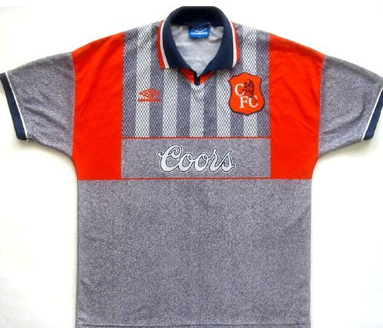 1 Chelsea away 1995-96
Along with the infamous brown Coventry kit of the late seventies and the early nineties Arsenal ‘vomit’ kit, the Chelsea away kit of 1995 is up there with the worst kit designs ever produced. In a perverse way there is a part of me that does like it, only because it reminds of a time when kit’s were at their craziest (think England’s ‘refreshers’ goalkeeper kit from Euro 96), but it terms of colours and design this really is a shocker. A combination of granite and bright orange, a colour that should only be twinned with black at best, was merged with a design that included contrasting shades and horrible shoulder panels. A real mess of a kit and a colour scheme that’s yet to repeated by Umbro.
You may remember this from… Two heartbreaking Chelsea wins in quick succession at Loftus Road in the 1995/96 season. Bradley Allen missed an equalizing penalty in the FA Cup, Paul Furlong scored a last second winner in the league game.
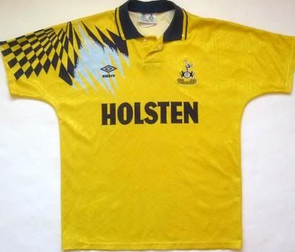 2 Tottenham away 1992-93
Before the two shirts that made it into the best bunch, came this away effort from Spurs that was worn throughout the early Premier League days as an away and then third shirt. A bright yellow shirt, which for me is never a good start, is combined with an interesting navy and silver pattern that looked like a mix of something from Tron (the eighties version) and one of those magic eye pictures. Utterly unnecessary and ruin’s what may have been a simple but effective design.
You may remember this from… Tottenham’s spectacular 4-1 defeat at Loftus Road in 1992/93 that featured a headed goal from Ray Wilkins.
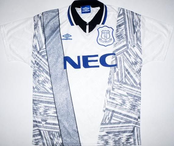 3 Everton away 1994-95
The early 1990s Umbro theme continues with this change shirt from Everton in 1994. I like the basic colour combination here, a nice vibrant ‘Everton blue’ mixed with black and grey but it’s how it’s put together that puts this kit in the top three. With two massive panels down each side of the shirt, with zig-zaggy type lines that look like they have been drawn by someone who’s used to drawing blue-prints rather then football kits. It’s made even more fussy by the right panel having an extra strip filled in without the zig-zags and just a pale navy. A real ‘what were they thinking?’ kind of kit.
You may remember this from… Everton’s 3-2 win at Loftus Road in 1995, sealed in injury time from 30 yards by Andy Hinchcliffe.
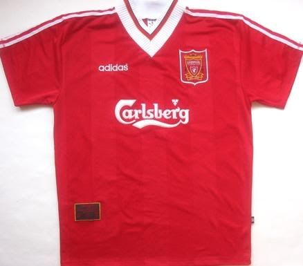 4 Liverpool home 1995-96
From Umbro’s ridiculously busy kits to a simple adidas Liverpool home shirt with one of the worst collars I’ve seen on a football shirt. Best remembered for Sky’s favourite Premier League game, the last-gasp 4-3 win that condemned Newcastle to title misery, this shirt was standard Red’s design with the usual Adidas lines on the arms but ruined by what was round the neck. I don’t mind a v-neck collar but this was like a truly enormous v-neck that almost gave the impression that Stan Collymore and co were walking around with serviettes round the necks. A template Adidas thankfully have never repeated.
You may remember this from… A 1-0 defeat at Anfield early in QPR’s relegation year where Rangers were actually the best team for the majority of the game.
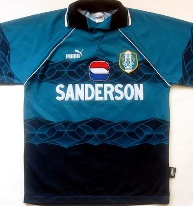 5 Sheffield Wednesday away 1995-96
These days Puma are one of football’s most prominent players, but back in 1995 they were still a long way off the big boys and in their infancy as kit designers. So maybe it explains this horrible design for this Sheffield Wednesday’s change kit from 1995. A base colour that can be best described as ‘marine’ or dark turquoise is bad enough, but the designers gave the shirt a strange wavy lines halfway down the jersey that merges into a darker more navy colour in to the bottom of the top. I applaud the difference in colour but it’s frankly an awful, awful design.
You may remember this from… A dire 3-0 home defeat by Wednesday at the beginning of our relegation season, Mark Bright running amok.
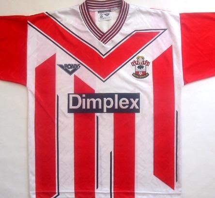 6 Southampton home 1993-94
A perfect example of how a sportswear company can get too big for their boots and incorporate so much into a kit that it ruins it completely. Here, American brand Pony forget all about the traditional Southampton red and white stripes and instead place their logo, a huge ‘v shape’ across the centre part of the jersey. A decision made even more disappointing as the rest of design is actually quite smart and was a fresh approach to the problem of making striped jersey’s look different. Unfortunately someone at Pony wanted the company to get their branding recognised but went overboard here. For a modern day example check out any of the last couple of Bolton home shirts.
You may remember this from… A win at The Dell, Les Ferdinand with the only goal of the game after a massive effort by Ken Monkou.
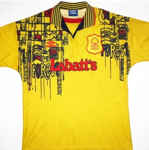 7 Nottingham Forest away 1995-96
The more I look at this shirt the more I get lost in the detail in what is another classic from Umbro’s 90’s catalogue. On first glance you’d be forgiven in thinking this was a Watford shirt due to the colour scheme and it’s actually a nice shade of yellow and as a smart polo-like collar. However, it seems Umbro’s design team went a bit art deco crazy on the shoulders, with a painted Forest mosaic that looked like the badge had been stamped on with an ink-stamp that is running out of ink. This probably was a good idea in theory but it wasn’t put together well at all.
You may remember this from… Forest never wore it against QPR, but the mental design clashed nicely with Jason Lee’s pineapple hair cut in other games.
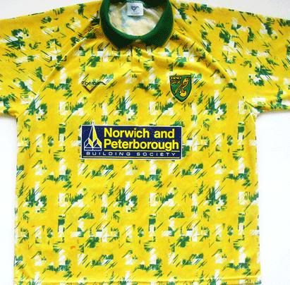 8 Norwich home 1992-93
Norwich fans will always hold this shirt in high-regard, as it was worn during the heady days of top five Premier League finishes and European nights in Munich, but in reality it’s a shocking piece of clothing. Obviously the yellow is hard to ignore with Norwich, so I can forgive makers Ribero for that, but what’s with the green and white flakes? It’s like one of Trafalgar Square’s most famous residents have taken an almighty number two on the jersey. The sponsor doesn’t help either, boxed-out on a completely different colour background it makes this whole design a right old mess. Still if you beat Bayern in their own backyard, who cares what you’re wearing eh?!
You may remember this from… QPR’s annual Carrow Road defeat, 2-0 on this occasion thanks in no small part to Chris Sutton who scored a flying header.
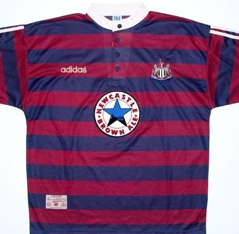 9 Newcastle away 1995-96
Maybe I resent it more because it was Sir Les’ I had to see in it the season after he left, but Newcastle’s 1995 away kit was still a naff design - especially the collar. In what was more like a rugby design, the shirt featured navy and dark red horizontal stripes with a unusual button-up collar that look as though it was modeled on shirts from the 1920’s. I’m all for retro-looking designs but it just didn’t come-out very well on this occasion.
You may remember this from… Newcastle beat QPR 3-2 at Loftus Road thanks to Les Ferdinand and a late cock up by Karl Ready and Jurgeon Sommer but wore black that day. This was the shirt David Ginola made his name in that season.
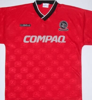 10 QPR away 1994-95
I chose this because of all the shirts Rangers had in our last Premier League era, this for me was the worst. I don’t think we should ever use all red for our away kit, and if we do it should be a lot more exciting the this dull lazy effort . The only redeeming feature to this was the QPR badges sewn into the fabric but everything else was just a bit bland.
You may remember this from… A classic 3-0 win at Goodison park where Rangers were about as good as they had ever been and Bradley Allen notched a classy hat trick.
Did we mention @loftforwords is now on Twitter? @ashrose83 is as well, should you be so inclined.
What to read next:
If you saw the match, please give us your player ratings and a mini match report.
If you saw the match, please give us your player ratings and a mini match report.
If you saw the match, please give us your player ratings and a mini match report.
If you saw the match, please give us your player ratings and a mini match report.
If you saw the match, please give us your player ratings and a mini match report.
If you saw the match, please give us your player ratings and a mini match report.
If you saw the match, please give us your player ratings and a mini match report.
If you saw the match, please give us your player ratings and a mini match report.
If you saw the match, please give us your player ratings and a mini match report.
If you saw the match, please give us your player ratings and a mini match report.