| Crest Vote on 15:17 - Dec 15 with 3414 views | zicoshoops |
Call me old fashioned, but..........
Apostrophe.
Apostrophe.
Apostrophe.
What's going on?
We should be told.
Sort it out. |  | |  |
| Crest Vote on 15:18 - Dec 15 with 3403 views | RangersDave |
"Option 3 is a new identity, and is built around full hoops, which are the clubs core equity"
yeah really? may i suggest you look at the shirts and show me where you truly believe that you muppets (not aimed at LFW members but QPR HQ)! |  |
|  |
| Crest Vote on 15:20 - Dec 15 with 3400 views | QPunkR |
I voted #2 but the more I've gazed upon them since I've come to the conclusion that #1 fits slightly better in there. The second one, though my preferred lettering, just seems like it's been crowbarred in a bit.
Can see what they've tried to do with 3 and 4, something different, but like others I'm astounded Dave Thingy (his new name) didn't offer up the Club the same designs as he Twittered all over the place. Those had pretty much universal approval. |  |
|  |
| Crest Vote on 15:22 - Dec 15 with 3390 views | Stanisgod |
Got to be 2. Why not just go back to the 82 one as thats practically it anyway. |  |
| It's being so happy that keeps me going. |
|  |
| Crest Vote on 15:23 - Dec 15 with 3382 views | themodfather |
i voted 2 but overall poor designs, i imagine we went to a "company" and this is what they offer? |  | |  |
| Crest Vote on 15:24 - Dec 15 with 3381 views | Northernr |
| Crest Vote on 15:23 - Dec 15 by themodfather |
i voted 2 but overall poor designs, i imagine we went to a "company" and this is what they offer? |
No, as explained earlier in the thread, they did what everybody asked and went to the QPR fan. Carry on though. |  | |  |
| Crest Vote on 15:40 - Dec 15 with 3350 views | robith |
I like all of them tbh. Pref is for one, because I've always liked straight lines in design, but I dig the hoop effect on 3 & 4, very slick. |  | |  |
| Crest Vote on 15:47 - Dec 15 with 3324 views | Mick_S |
Number two, for me. Three and four look like keyrings or that game you play at school fetes trying to avoid setting the buzzer off as you guide the bendy metal thing around the whatever it's called. [Post edited 15 Dec 2015 15:48]
|  |
| Did I ever mention that I was in Minder? |
|  |
Login to get fewer ads
| Crest Vote on 15:49 - Dec 15 with 3313 views | Juzzie |
3 & 4 are too busy on the eye IMO. #4 has a tiny crown, a nod towards Queen Victoria's reign when we were formed? | 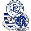 | |  |
| Crest Vote on 16:09 - Dec 15 with 3283 views | brad |
| Crest Vote on 11:27 - Dec 15 by paulparker |
Why don't we just have the old one back we had before ? , fcuk all wrong with it ,
and we would save money on employing a bunch of fcukwits who don't have a clue what they are doing as well
seriously can't this club get anything right, |
totally agree!go back to the old one,or keep to the present one,those are rubbish they put up on the web site,its a joke,are they takin the piss with those designs? |  | |  |
| Crest Vote on 16:17 - Dec 15 with 3272 views | johncharles |
| Crest Vote on 13:58 - Dec 15 by DannyPaddox |
Stop Press: Late Entrant: Vote now!
 |
Nice one Danny, part of our heritage. | 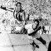 |
| Strong and stable my arse. |
|  |
| Crest Vote on 16:19 - Dec 15 with 3260 views | Neil_SI |
I was fortunate enough to see the work in progress designs prior to these final mock ups, and the progression from those has been pleasant. They feel QPR to me, which is important, but you'll never please everybody.
Logo design is a tricky business and a lot of people mistake simplicity for childish work in this area. It's a lot more involved than that usually.
These badges will also go on different kits, marketing materials and props, so their colours may be inversed and their physical properties very different, depending on the object it's on.
Therefore it's important it works well in a variety of scenarios, and it's good to see the club showing the designs with blue on white, white on blue and on the home kit at least.
I actually like them all, even though I initially only warmed to Options 1 and 2. Sometimes it takes a while for logos and things like this to settle in and grow on you, which is normal. I do think however that Options 3 and 4 need a little more evolution, and these are 'newer' designs from the work in progress bades I had seen previously.
Option 1 surprised me. I've not always been a fan of the retro letters in some circumstances, but I think they work well here. It's a good clean blend of retro and modern.
Option 2 is my current favourite, and is the safe choice for me, though I'd imagine that's because the lettering is from my generation and what I grew up with. It just feels more like home.
Option 3 and 4 are interesting plays. Perhaps with a bit more time, they would have been a new and worthwhile twist and representation of the badge. I'm not so keen on the font used for the outer lettering and perhaps for the QPR lettering too, but they have potential.
I'd be reasonably happy with them all, with my order of preference being 2, 1, 4 and 3. It would have been a smart idea for the club to allow you to rank the options.
They could have perhaps then used that information to change the badge if they felt worth doing so, for any kind of unique anniversary style kits that clubs sometimes do. [Post edited 15 Dec 2015 16:25]
|  | |  |
| Crest Vote on 16:36 - Dec 15 with 3203 views | itsbiga |
#2 for me. Don't like 3 and 4 as they seem too busy. On the shirt no 1 looks a bit like CPR. |  |
|  |
| Crest Vote on 16:43 - Dec 15 with 3188 views | RANGERS4EVER |
There are also pictures of them on this seasons shirt and they all look grear. much nice than the current one. 2 definite winner |  |
|  |
| Crest Vote on 16:43 - Dec 15 with 3187 views | ElHoop |
They all look the same to me, but then again I'm clueless at anything like this. It's a bit like one of those spot the difference quiz things you used to get in comics and stuff when I was a kid - the bloke hasn't got a shoelace on one shoe, there's no belt and his dog's collar is missing. [Post edited 15 Dec 2015 16:44]
|  | |  |
| Crest Vote on 16:47 - Dec 15 with 3178 views | Match82 |
I don't mind them, theyre just a modernized, simplified version of the 80s badge, which was my favourite. Dont have a problem with them modernizing it, way of the world.
2 is the best IMO |  | |  |
| Crest Vote on 16:50 - Dec 15 with 3176 views | isawqpratwcity |
| Crest Vote on 15:40 - Dec 15 by robith |
I like all of them tbh. Pref is for one, because I've always liked straight lines in design, but I dig the hoop effect on 3 & 4, very slick. |
#1 is probably my least favourite. I find the 'blocky' font absolutely charmless, which is why I've also never been a fan of the old badge that simmo uses for his avatar. |  |
|  |
| Crest Vote on 17:02 - Dec 15 with 3148 views | dixiedean |
| Crest Vote on 12:08 - Dec 15 by Juzzie |
Our previous badge which came out circa 1982 had both on and it's one of the most popular amongst the fans. I don't think anyone minded the last few decades that both the full name and the initials were on it. Most comments seem to be about the missing apostrophe!
 |
the 80s one ( FA Cup Final ) is my all-time fave ( apart from the Hammersmith crest from the 60s) . As for the new offerings- what is all this pretentious BS about 3 & 4 having full hoops ? They have incomplete circles which are no more hooped than the back of the home kit.
That is marketing mumbo-jumbo.. No 2 is the best of a poor bunch. If we all abstain will they start again ? Probably not. But at least we're all agreed they're better than current one, but then again so would a picture of a turd. |  | |  |
| Crest Vote on 17:07 - Dec 15 with 2968 views | barbicanranger |
Number 2 for me.
Thought they would come up with 4 completely different themed ones; a shield, a modification of the 80's badge (the last one we had) and few others but it seems the results of the initial survey all arrived at a preference for a round badge, with large lettering so they are all ultimately a derivative of the last badge we had, which I actually like the most and relate to the most. [Post edited 15 Dec 2015 17:08]
|  | |  |
| Crest Vote on 17:18 - Dec 15 with 2936 views | Nov77 |
If they got rid of the circles and the name and just had the initials with 1882 underneath I think they'd be onto something. |  |
|  |
| Crest Vote on 17:22 - Dec 15 with 2922 views | HanwellHoop |
Voted for no 2
Best of a bad bunch |  | |  |
| Crest Vote on 17:28 - Dec 15 with 2903 views | PlanetHonneywood |
Apparently, some wag has tweeted that the Q in option 2 looks like a penis.
I don't wish to rake over old coals, but that hideous thing on the top of the badge in option 4, is it one of those old tomato ketchup dispenser things?

Personally, I think the options are poor. I was expecting a straight shoot out between something close to the 1970's badge or the 1982 version. Its like, the club has said ok we'll let you believe you're choosing the badge, but as long as its what we want.
With a Colt 45 to my head and electrodes wired to my gonads, option 1. Just mind you. |  |
|  |
| Crest Vote on 17:29 - Dec 15 with 2903 views | QPR1882 |
2 is the best of a very poor bunch |  | |  |
| Crest Vote on 17:30 - Dec 15 with 2899 views | Rblock_James |
Number 2 for me.
Massive improvement from the current abomination.
Well done to the club. |  | |  |
| |