By continuing to use the site, you agree to our use of cookies and to abide by our Terms and Conditions. We in turn value your personal details in accordance with our Privacy Policy.
Please log in or register. Registered visitors get fewer ads.
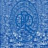
Aye, I'd agree with what's been said above pretty much. Option A for me from these two. Mainly because the tails of the P and R interact more naturally. While I don't mind the updated font in B, the tails end up looking slightly messy to my eye. The leg of the P being slightly shorter does serve to unclutter the whole thing a bit, though.
A step closer to the classic crest but retaining a nod to the SuperHoops - thanks for the feedback, not all positive of course but some has been constructive. We are determined to get a badge that most of us will like - building on our heritage but looking to the future, but we know its a very hard task to please everyone!
I like the version on the far left. It has the Hoops but I prefer that they aren't a continuation of the Q and R. I think it's somewhere between 2 and 3.
Could the club run the vote again using the two most popular to date with a third incorporating some tweeks based on feedback of the four current options?