| Design Your QPR Kit comp 17:45 - Jun 2 with 3094 views | Toast_R |
https://www.qpr.co.uk/news/club-news/we-want-your-kit-designs/
Come on then, who's having a go? I printed off some templates for my son to have a go at, he's a bit too young though so giving it a go myself.
Think I've nailed it, not sure how I'd post some images on here mind but its a revamped 84 with a bit of 89/90 thrown in. |  | | |  |
| Design Your QPR Kit comp on 08:05 - Jun 3 with 2880 views | Metallica_Hoop |
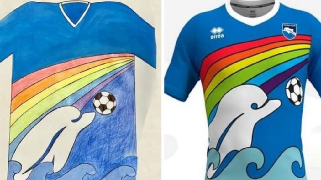
As long as no one thinks 'Yeah this is great, lets use it'.
 |  |
| Beer and Beef has made us what we are - The Prince Regent |
|  |
| Design Your QPR Kit comp on 08:24 - Jun 3 with 2865 views | thame_hoops |
| Design Your QPR Kit comp on 08:05 - Jun 3 by Metallica_Hoop |
As long as no one thinks 'Yeah this is great, lets use it'.
 |
Why do you hate dolphins? 😜 |  | |  |
| Design Your QPR Kit comp on 08:31 - Jun 3 with 2858 views | Metallica_Hoop |
| Design Your QPR Kit comp on 08:24 - Jun 3 by thame_hoops |
Why do you hate dolphins? 😜 |
I can remember where or when but I saw a beach towel just like this when I was a kid  |  |
| Beer and Beef has made us what we are - The Prince Regent |
|  |
| Design Your QPR Kit comp on 09:59 - Jun 3 with 2801 views | Toast_R |
Theres some pretty decent ones on Instagram under #DesignRKit |  | |  |
| Design Your QPR Kit comp on 11:36 - Jun 3 with 2749 views | DannyPaddox |
| Design Your QPR Kit comp on 08:05 - Jun 3 by Metallica_Hoop |
As long as no one thinks 'Yeah this is great, lets use it'.
 |
Are those kits tuna-friendly ? |  | |  |
| Design Your QPR Kit comp on 11:59 - Jun 3 with 2716 views | slmrstid |
| Design Your QPR Kit comp on 09:59 - Jun 3 by Toast_R |
Theres some pretty decent ones on Instagram under #DesignRKit |
Just had a look, yeah some of them look ace.
Some absolutely horrendous too, but then beauty is in the eye of the beholder  |  | |  |
| Design Your QPR Kit comp on 15:27 - Jun 3 with 2583 views | bosh67 |
| Design Your QPR Kit comp on 08:05 - Jun 3 by Metallica_Hoop |
As long as no one thinks 'Yeah this is great, lets use it'.
 |
When I drew that it was meant to be f*cking Concorde! |  |
|  |
Login to get fewer ads
| Design Your QPR Kit comp on 16:04 - Jun 3 with 2550 views | W7Ranger |
| Design Your QPR Kit comp on 15:52 - Jun 3 by CamberleyR |
Sorry Toast, a noble effort but not for me I'm afraid. For me, our best shirts have always been when we have four blue hoops starting with one covering the neck and shoulders like the 1983-84 shirt.

With yours there's a bit too much white on show and I'm not a massive fan of a lot of red on our shirts either. The 83-84 shirt had red but the thin red hoops surrounding the blue hoops on that particular shirt was quite subtle. |
Has Fenwicks top got a red adidas logo and QPR badge? |  | |  |
| Design Your QPR Kit comp on 16:07 - Jun 3 with 2543 views | MickS_ |
| Design Your QPR Kit comp on 16:04 - Jun 3 by W7Ranger |
Has Fenwicks top got a red adidas logo and QPR badge? |
Well spotted - certainly has in my house. |  | |  |
| Design Your QPR Kit comp on 16:20 - Jun 3 with 2521 views | CamberleyR |
| Design Your QPR Kit comp on 16:04 - Jun 3 by W7Ranger |
Has Fenwicks top got a red adidas logo and QPR badge? |
This article mentions it.
http://qprkits.blogspot.com/2011/09/198384.html
The red adidas logo and club badge was the early season version but later on in the season adidas changed both to white but occasionally both versions would surface in a game such as that photo against Stoke which was from April 1984. | 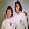 |
|  |
| Design Your QPR Kit comp on 18:04 - Jun 3 with 2478 views | Toast_R |
| Design Your QPR Kit comp on 15:52 - Jun 3 by CamberleyR |
Sorry Toast, a noble effort but not for me I'm afraid. For me, our best shirts have always been when we have four blue hoops starting with one covering the neck and shoulders like the 1983-84 shirt.

With yours there's a bit too much white on show and I'm not a massive fan of a lot of red on our shirts either. The 83-84 shirt had red but the thin red hoops surrounding the blue hoops on that particular shirt was quite subtle. |
Thank you for feeding back. First time I went with a black trim instead of red, I remember seeing a prototype QPR design before the 2001/02 season where a vast section of the shirt around the collar snd shoulders was black, it got voted down and never saw daylight but the concept was interesting. When I created a version of it the other night, it looked like what Fulham Park Rangers would have morphed into and just not right at all.
As I say my design was an attempt at a nod to the Influence 89/90 shirt which was my personal fave. |  | |  |
| Design Your QPR Kit comp on 21:05 - Jun 3 with 2413 views | rsonist |
| Design Your QPR Kit comp on 18:04 - Jun 3 by Toast_R |
Thank you for feeding back. First time I went with a black trim instead of red, I remember seeing a prototype QPR design before the 2001/02 season where a vast section of the shirt around the collar snd shoulders was black, it got voted down and never saw daylight but the concept was interesting. When I created a version of it the other night, it looked like what Fulham Park Rangers would have morphed into and just not right at all.
As I say my design was an attempt at a nod to the Influence 89/90 shirt which was my personal fave. |
Too much not-white is where people usually come a cropper with these - the Reading trap. |  | |  |
| |