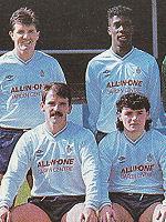
Fans to decide next season's kits
Friday, 2nd Nov 2012 09:05 by Col
The club want your help with choosing next season's home and away kits, with three options to choose from for each.
It may only be November, but the selection process for next season's kits is well underway and for the first time in almost ten years, fans will get to choose which kits we play in next season.
Selections can be mixed. For example if you like the Home Kit 1 and Away Kit 3, then that option is available to you - you are not being asked to select a pair. All you have to do is email the club at competitions@rochdaleafc.co.uk with which two kits you prefer. All votes have to be made by 3pm on Saturday 17th November.
If you cannot decide from the images, all six shirts are being presented in the club shop for the next fortnight to allow a closer inspections. Votes can also be made in there if you prefer to do so.
Home 1 Away 1

Home 2 Away 2

Home 3 Away 3

Photo: Action Images
Please report offensive, libellous or inappropriate posts by using the links provided.
Syke_Dale added 10:02 - Nov 2
Option 3 for me.... |  | |
Albert_Whitehurst added 15:56 - Nov 2
New kits again..??? How many years in a row have we changed both kits? |  | |
DaleView added 16:19 - Nov 2
Yes, it's all about removing more cash from your pockets.
I liked the days when the away team changed colours only when there was a clash.
Nowadyas it's difficylt to remember what the true team colours are.
I will go for option 2 if only because Dale seem to win more games playing in yellow.
But I will not be buying one. I buy a programme every home game I attend so that is my "ex gratia" contribution. |  | |
TalkingSutty added 17:48 - Nov 2
Option 2 for me and 3 for Sutty Junior. |  | |
rafc1984 added 18:10 - Nov 2
Home 1 Away 3 |  | |
AtThePeake added 18:10 - Nov 2
Good idea giving the fans the choice, I just don't like the choices.
Option 1: The away kit clashes even more with the home kit than our promotion season purple kit did. There are also way too many stripes.
Option 2: Good amount of stripes, but the collar and the white trim between the main body and the sleeves give it a very generic 90's pub team look. Not a fan at all. The away kit has a similar feel, and I'm not a massive fan of yellow as it is.
Option 3: Not enough stripes, and I don't understand that little white triangle thing underneath the collar. The away kit is fairly smart though.
I'll be sticking to my retro shirts I think. They're cheaper for a start and don't go out of date after one season... |  | |
DomDale added 18:44 - Nov 2
Home 1 , Away 3 for me! |  | |
roccydaleian added 19:00 - Nov 2
Home 2, away 3, would be my choice. |  | |
Bazzanne added 00:54 - Nov 3
Home 2 Away 3 for me |  | |
sandylaner23 added 09:45 - Nov 3
Both option 1's look like training tops.
I'd go for both option 2's with the away option 3 as a 3rd kit if required |  | |
DaleFan7 added 15:04 - Nov 3
Who designs these things!? They're all disgusting! If I had to choose it would be option 3. |  | |
Shun added 20:52 - Nov 3
Home 1 Away 2 |  | |
wimborne_dale added 13:40 - Nov 15
Home 2 Away 2.
Home 2 has good old traditional Football-kit width stripes. It's the closest to our promotion winnig Inter stripes.
Away 2 because Yellow is the photographic opposite of blue, so complements it well.
I think in the case of 1, pin-stripes never looked good on a football kit and 3 just reminds me of some of the bad-taste designs that crept in during the late '70s, (e.g Southampton and Wales) |  | |
gresh1 added 21:35 - Nov 15
Option 1 for me. But thicker stripes. And keep our yellow one from this season for an away option. |  | |
pnc4eva1 added 18:38 - Nov 16
Number twos for me |  | |
BobsAdaley added 22:03 - Nov 16
Option 3 then 2 if need be
|  | |
You need to login in order to post your comments |
Blogs 32 bloggersAccrington Stanley Polls |
